flex布局
CSS的Flex布局(Flexible Box Layout)是一种用于在页面上布置元素的高效方法,特别适合于响应式设计。Flex布局使得元素能够伸缩以适应可用空间,可以简化很多原本需要复杂CSS和HTML结构才能实现的布局设计。
flex布局包括flex容器和flex项
-
flex容器属性
1.display: flex | inline-flex:启用flex布局。 flex作为块级弹性伸缩盒显示;inline-flex 作为内联块级弹性伸缩盒显示。
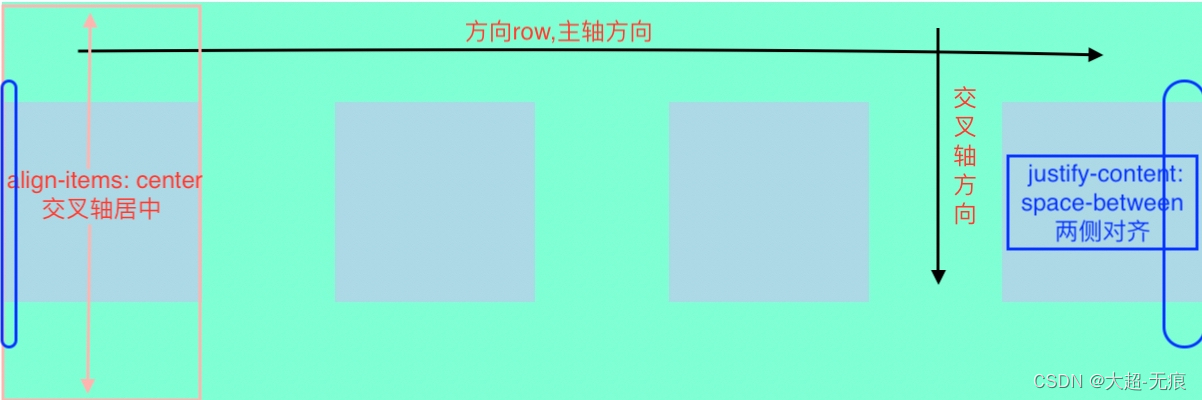
2.flex-direction: row | row-reverse | column | column-reverse:决定主轴的方向。
3.justify-content: flex-start | flex-end | center | space-between | space-around | space-evenly:设置主轴上的对齐方式。
4.align-items: stretch | flex-start | flex-end | center | baseline:设置交叉轴上的对齐方式。
5.align-content: stretch | flex-start | flex-end | center | space-between | space-around:多行Flex项在交叉轴上的对齐方式(单行无效)。
6.flex-wrap: nowrap | wrap | wrap-reverse:设置flex项是否可以换行。
7.flex-flow:flex-direction 和 flex-wrap 的简写。 -
flex项属性
1.flex-grow:定义flex项的放大比例。
2.flex-shrink:定义flex项的缩小比例。
3.flex-basis:定义flex项在分配多余空间之前的默认大小。
4.flex:flex是flex-grow, flex-shrink和flex-basis的简写。
5.align-self:允许单个flex项有与其他项不一样的对齐方式,覆盖align-items。
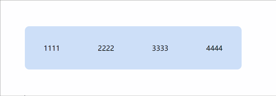
举个例子
代码示例
<body><div class="flex-container"><div class="flex-item"></div><div class="flex-item"></div><div class="flex-item"></div><div class="flex-item"></div></div></body><style>.flex-container {width: 600px;height: 200px;background-color: aquamarine;display: inline-flex;flex-direction: row;justify-content: space-between;align-items: center;}.flex-item {width: 100px;height: 100px;background-color: lightblue;}</style>
渲染示例:
易混淆属性总结
1.flex-grow
设置 flex 项主尺寸的 flex 增长系数,负值无效,默认为 0。flex-grow 分配剩余空间即 flex 容器的大小减去所有 flex 项的空间;
剩余空间 = 容器空间 - 所有flex项所占空间;
<body><div class="flex-container"><div class="flex-item item1"></div><div class="flex-item item2"></div><div class="flex-item item3"></div><div class="flex-item item4"></div></div></body><style>.flex-container {width: 600px;height: 200px;background-color: aquamarine;display: inline-flex;flex-direction: row;justify-content: space-between;align-items: center;}.flex-item {width: 100px;height: 100px;background-color: lightblue;}.item1 {flex-grow: 1;background-color: lightcoral;}.item2 {background-color: lawngreen;}.item3 {background-color: lightcyan;}.item4 {background-color: lightseagreen;}</style>
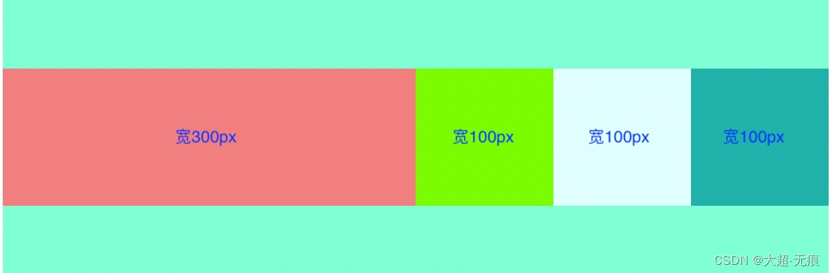
同理,有多个元素设置不同的flex-grow数值,则按照比例分配剩余空间。
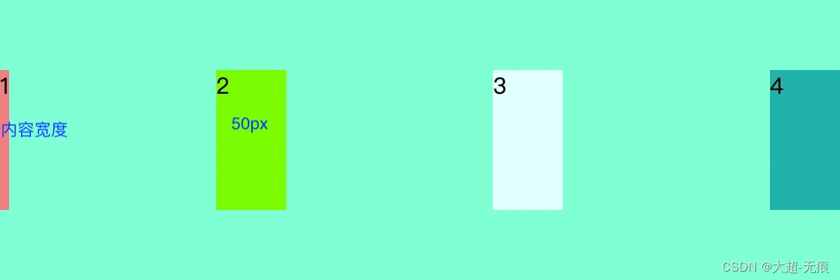
2. flex-basis
指定了 flex 元素在主轴方向上的初始大小。如果不使用 box-sizing 改变盒模型的话,那么这个属性就决定了 flex 元素的内容盒(content-box)的尺寸。
.flex-item {flex-basis: 50px;height: 100px;background-color: lightblue;}.item1 {flex-basis: max-content;background-color: lightcoral;}.item2 {background-color: lawngreen;}.item3 {background-color: lightcyan;}.item4 {background-color: lightseagreen;}
3. flex-shrink
flex 元素仅在默认宽度之和大于容器的时候才会发生收缩,其收缩的大小是依据 flex-shrink 的值。负值不允许。默认值 1,在默认情况下flex项宽度加一块超出容器时,会等比例缩小。
.flex-item {width: 180px;height: 100px;background-color: lightblue;flex-shrink: 0;}.item1 {flex-shrink: 1;background-color: lightcoral;}.item2 {background-color: lawngreen;}.item3 {background-color: lightcyan;}.item4 {background-color: lightseagreen;}
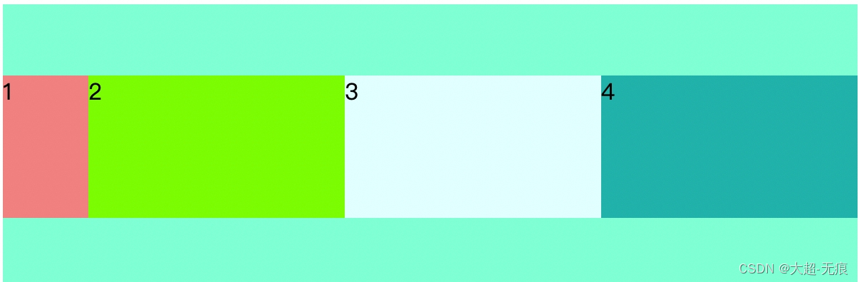
box1宽度 = 600 - 180 * 3 = 60;同理,有多个元素设置不同的flex-shrink数值,则按照比例分配空间。
4. flex:1 | 0 | auto | none
flex属性是flex-grow、flex-shrink、flex-basis三个属性的简写,默认值是flex: 0 1 auto。默认有剩余空间,不会自动放大;超出时会等比例缩小。
-
flex:1是flex-grow: 1;flex-shrink: 1;flex-basis: 0%;的缩写。flex-basis 0%表示0,无尺寸,以实际内容宽度为主,会覆盖设置的width。
-
flex:0是flex-grow: 0;flex-shrink: 1;flex-basis: 0%;的缩写。
-
flex:auto是flex-grow: 1;flex-shrink: 1;flex-basis: auto;的缩写。
-
flex:none是flex-grow: 0;flex-shrink: 0;flex-basis: auto;的缩写。
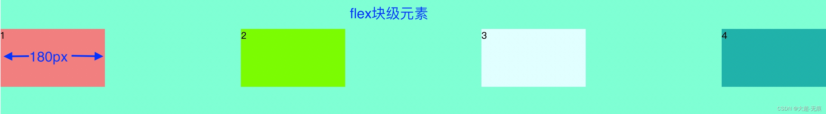
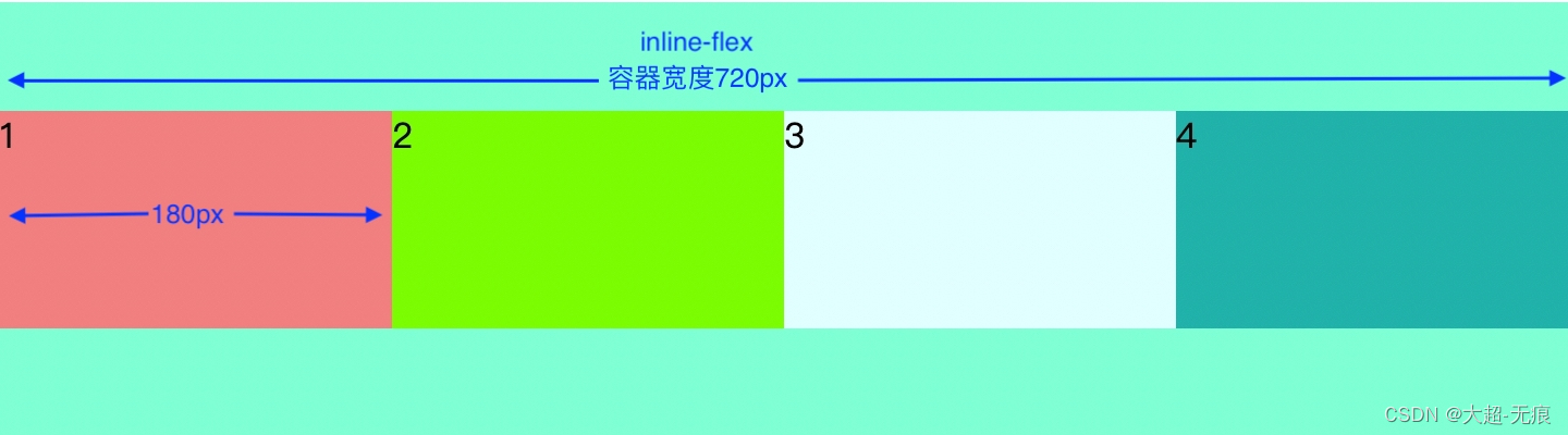
5. display: flex | inline-flex
inline-flex
代码示例
<body><div class="flex-container"><div class="flex-item item1">1</div><div class="flex-item item2">2</div><div class="flex-item item3">3</div><div class="flex-item item4">4</div></div></body><style>.flex-container {height: 200px;background-color: aquamarine;display: inline-flex;flex-direction: row;justify-content: space-between;align-items: center;}.flex-item {width: 180px;height: 100px;background-color: lightblue;}.item1 {background-color: lightcoral;}.item2 {background-color: lawngreen;}.item3 {background-color: lightcyan;}.item4 {background-color: lightseagreen;}
flex
代码
display: flex;